
A business website is often one of the first places customers interact with a brand. Before making an inquiry, visiting a shop, booking a service, or purchasing a product, people frequently explore a business online to decide whether it appears professional and relevant to their needs. The quality of that experience can influence what they do next.
Professional web designers consider much more than visual appearance. They think about how visitors move between pages, find information, use different devices, and complete important actions. Every element should contribute to an experience that feels straightforward rather than creating unnecessary obstacles.
For homeware brands, health and wellness businesses, and retailers in Doncaster, these considerations are particularly valuable. Customers may want to compare products, understand services, check important information, or contact the business quickly. A carefully planned site helps make each of these interactions easier.
This article explores five areas where professional planning can improve the customer experience and create a stronger digital foundation for businesses.
Creating Clear and Intuitive Navigation
Navigation has a significant influence on how comfortable people feel when using a business site. Visitors usually arrive with a purpose, and they should be able to understand where to go without having to study complicated menus or search repeatedly for important information.
A clear navigation structure starts by identifying the pages customers are most likely to need. Services, product categories, contact information, delivery details, booking pages, and other important areas should be organised logically. Labels should also describe destinations clearly rather than relying on vague wording.
Professional website design considers the relationship between pages as part of the wider customer journey. Instead of treating each page independently, the structure guides visitors from their initial point of interest towards supporting information and an appropriate next step.
This is especially useful for businesses with growing product ranges or multiple services. Without careful organisation, adding more content can make navigation increasingly difficult. A scalable hierarchy allows new pages to be introduced while preserving clarity.
Internal links can further improve the journey. A customer reading about one service may benefit from being directed towards related information, while someone viewing a product category might need easy access to delivery details or frequently asked questions.
Navigation should also remain familiar across the site. Moving menus between pages, changing labels unnecessarily, or presenting important information differently can create uncertainty. Consistency reduces the amount of effort required from visitors and makes the experience feel more dependable.
For businesses planning long-term growth, navigation is therefore not simply a menu at the top of a page. It is part of the framework that determines whether customers can use the site confidently as its content expands.
Designing Around Real Customer Behaviour
Customers do not always interact with websites in the way businesses expect. Some carefully read detailed information, while others scan headings and look immediately for prices, products, opening details, or contact options. A strong user experience accommodates these different behaviours.
Professional teams consider how information is likely to be consumed and structure pages accordingly. Important messages receive appropriate prominence, while supporting information remains available without overwhelming the visitor.
Several practical principles contribute to this approach:
- Clear headings allow visitors to understand page content quickly and locate relevant sections.
- Short, focused paragraphs make detailed information easier to scan, particularly on smaller screens.
- Appropriate spacing separates ideas and prevents pages from appearing crowded or difficult to follow.
- Important actions are positioned where customers naturally need them rather than appearing randomly throughout the page.
- Images support products, services, or messages instead of being included purely for decoration.
- Consistent visual hierarchy helps customers distinguish primary information from supporting details.
- Forms request only information that is genuinely useful, reducing unnecessary effort when making an inquiry.
- Interactive elements behave predictably so visitors understand what will happen when they select them.
These considerations are particularly important for homeware and retail businesses, where customers may browse numerous products before deciding what interests them. Wellness businesses may have different priorities, such as explaining services clearly and providing reassurance before someone books or gets in touch.
Good website development supports these behavioural considerations technically. The underlying structure needs to allow pages, forms, menus, and interactive features to work reliably so that the intended journey is preserved across browsers and devices.
Designing around genuine customer behaviour removes unnecessary friction. Rather than expecting visitors to adapt to the website, the website is organised around how people naturally look for information and make decisions.
Providing a Consistent Experience Across Devices
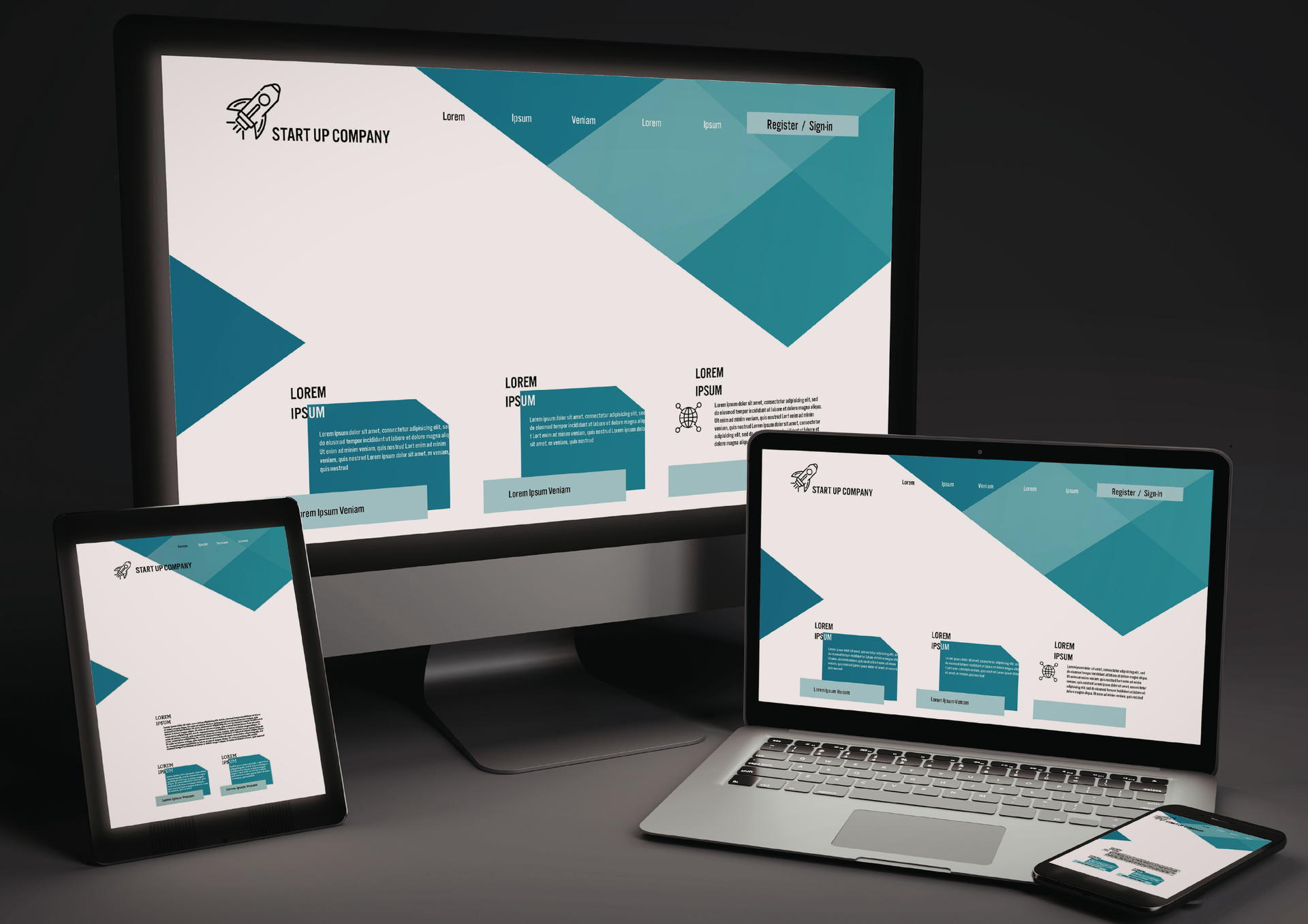
Customers may discover a business on a laptop and return later using a mobile phone. Others may complete the entire journey on a tablet or smartphone. The experience should remain clear and professional regardless of how the site is accessed.
Responsive layouts adapt content to available screen space rather than simply shrinking a desktop page. Navigation may need to change format, images need to resize appropriately, and columns may need to reorganise so information remains readable.
Mobile users also interact differently. They use touch rather than a mouse, often browse while multitasking, and may have less patience for complicated forms or slow-loading pages. Buttons therefore need sufficient spacing, text needs to remain readable, and important information should not require excessive zooming or horizontal scrolling.
Consistency does not mean every device must display an identical layout. The objective is to preserve the same quality of experience while adapting presentation to the context. A desktop visitor may benefit from wider product grids, while a mobile customer may need a simplified arrangement that makes individual items easier to explore.
Performance is equally important. Oversized imagery, unnecessary animations, and poorly optimised scripts can make pages feel slow, particularly on mobile connections. Thoughtful optimisation helps keep the experience responsive without removing useful visual content.
Businesses sometimes search for a website designer near me after noticing that an older site looks acceptable on desktop but becomes difficult to use on modern mobile devices. Addressing responsiveness as part of the overall planning process is more effective than treating mobile compatibility as a later adjustment.
A consistent cross-device experience also strengthens credibility. Customers should not encounter one version of a brand on desktop and a noticeably weaker experience on mobile. Maintaining the same level of clarity and professionalism supports confidence wherever the interaction takes place.
Improving Speed, Accessibility, and Everyday Usability
Customer experience depends heavily on practical performance. Visitors may never consciously notice that a site loads efficiently or that its controls are easy to use, but they are likely to notice when these fundamentals are handled poorly.
Professional web designers consider how technical and visual decisions work together to minimise barriers between visitors and the information they need.
Key areas include:
- Images should be appropriately sized and optimised so visual quality does not create unnecessary loading delays.
- Pages should avoid excessive scripts, effects, or features that add little customer value while increasing processing requirements.
- Text needs sufficient readability, with sensible font sizing, spacing, and contrast.
- Buttons and links should be clearly identifiable rather than forcing users to guess which elements are interactive.
- Forms need straightforward labels and useful error messages that explain how to correct incomplete information.
- Important content should remain accessible without relying entirely on decorative effects or complicated interactions.
- Page layouts should maintain a logical reading order, helping visitors understand information naturally.
- Broken links and outdated content should be addressed so customers are not directed towards missing or irrelevant information.
Accessibility is particularly important because businesses serve people with a wide range of needs, devices, and browsing circumstances. Clearer layouts, descriptive labels, keyboard-friendly interactions, and readable content can improve usability for a broad audience.
Speed also affects perception. A page that responds quickly feels more polished and dependable, while repeated delays can make even an established business appear less professional. Performance should therefore be considered during planning rather than addressed only after problems emerge.
Professional teams balance these requirements instead of optimising one area at the expense of another. A visually impressive feature may not be worthwhile if it significantly slows an important page, while an extremely minimal layout may fail to communicate enough information to customers.
The objective is practical balance: provide enough information and visual interest to communicate effectively while keeping the experience responsive, understandable, and accessible.
Building Trust Through Consistency and Clear Communication
Customer experience is closely connected to trust. Visitors are more comfortable engaging with a business when its digital presence feels organised, current, and consistent.
Visual consistency is one part of this. Typography, imagery, spacing, buttons, and other recurring elements should follow recognisable patterns. This creates familiarity as customers move through different sections and makes the overall experience feel intentional.
Content consistency matters just as much. Product information, service descriptions, contact details, and calls to action should not contradict one another. Keeping important information accurate reduces uncertainty and prevents customers from having to verify basic details elsewhere.
A professional website design company can also consider how a site's structure will accommodate future updates. This matters because trust can decline when websites gradually become cluttered or inconsistent as businesses add new products, services, promotions, and pages without an established framework.
For retail businesses, customers may expect clear information about products, availability, delivery, or returns. Homeware brands may need high-quality imagery alongside useful specifications. Health and wellness organisations may need to explain services in a calm, straightforward manner that helps customers understand their options.
Calls to action should also communicate clearly. Generic or overly aggressive prompts can feel disconnected from the customer's needs. Descriptive actions such as requesting information, viewing a range, or arranging a consultation can make the next step easier to understand.
Professional web designers bring these individual considerations together so that trust is reinforced throughout the journey rather than relying on a single testimonial, graphic, or statement. When visitors encounter consistent information and predictable interactions, they can concentrate on deciding whether the business meets their needs.
Long-term consistency also makes future growth easier. New pages can follow established patterns instead of introducing entirely different layouts, allowing the digital presence to evolve without losing the familiarity existing customers recognise.
Improving customer experience requires attention to the complete journey rather than individual visual elements. Navigation, content structure, responsive behaviour, performance, accessibility, and consistency all influence whether visitors can interact with a business comfortably.
For homeware brands, health and wellness businesses, and retailers, these principles help create digital experiences that serve practical customer needs while supporting commercial objectives. Customers can find information more efficiently, understand their options, and move towards an enquiry or purchase without unnecessary obstacles.
When these foundations are planned carefully, a website can remain useful as products, services, and customer expectations evolve. The result is a scalable digital platform that supports both immediate interactions and longer-term business growth.
ETA Web Design Doncaster provides experienced digital solutions focused on creating professional online experiences around genuine business and customer requirements. We consider how visitors navigate, read information, interact across different devices, and move towards meaningful actions before determining the most appropriate structure.
Our web designers prioritise clarity, scalability, and practical performance rather than adding complexity for its own sake. This allows businesses to develop an online presence that can accommodate new content, services, and opportunities while remaining straightforward for customers to use.
By combining careful planning with a user-focused approach, we help businesses create websites that communicate clearly, support customer confidence, and provide a reliable foundation for sustainable digital growth.
Check out our latest X update on how professional
web designers improve the customer experience!